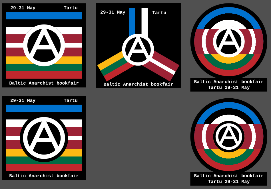
So I recently discovered there's an anarchist bookfair happening in Tartu, Estonia. So I made these icons as a way to contribute spreading the news. What do you think?
More info about the bookfair is here: https://riga-anarchist-bookfair.hotglue.me/
Discuss anarchist praxis and philosophy. Don't take yourselves too seriously.
Other anarchist comms
Join the matrix room for some real-time discussion.
So I recently discovered there's an anarchist bookfair happening in Tartu, Estonia. So I made these icons as a way to contribute spreading the news. What do you think?
More info about the bookfair is here: https://riga-anarchist-bookfair.hotglue.me/
Great job. They all look good.
The bottom 2 look best to me. I think the circular one is more interesting, but the square might be more easily understood.
Good luck with the bookfair :)
All good but the anarchist "A" should transcend the boundaries of the circle encompassing it for a more truly realistic graphic.
The one where the lines go past the circle is the one I call Punk Circled-A. The one I use is more restrained, making it appear more professional and approachable (in my opinion, obviously). But I did do one with the punk-A:
 . This one is drawn so it's a lot more free-form.
/sidenote: When I say drawn I mean as opposed to designed like the ones in the main post. They are all made in inkscape, but for me drawing is imperfect, while designing tries to maintain as much precision as possible, eg proper ratios, straight lines and equal spaces. While drawing is embracing the imprecision of a human hand.
I don’t really follow anarchy (this showed up on /all), but I really like this logo!
Good work.
I liked it before. I like it even better now. Good work!
This one is also quite cool imo. Probably would go with paint-like, curved streaks for the outmost lines and lean into the "aggressiveness", but I agree this is moving out from bookfair territory :)
That's just the punk/graffiti way, the original is within the circle.
Regardless of which group modified the original it looks better to me when the lines break the circle. It feels more representative. Art is subjective though.
I like the circular ones!
I really like the middle one
I like the top right best.
And warm greetings to Tartu! Havn't been there in a few years but it's a beautiful town.
Like one of the left ones, with the three flags stacked on top of each other, but round as a whole and the A full size over all of them.
Like this:

Hell yeah. Maybe switch black and white of the A? I don't know.
It's interesting for sure, but the A is very glaring. Making the border around the A bigger certainly improves it but then it starts covering up quite a lot of the flags. It also feels quite generic, I know the other ones are generic as well but this one just feels like "Take the flags and put an A over it." done.
I see what you mean. In that case take the one on the lower right of your original set.
I don't think the middle one really works tbh, but the other two I like a lot, left for stickers and right for patches. Maybe I would make the A bigger on the square ones so that the circle goes into the blue and red lines a little bit. Good work!
Can you make the circle that's formed by the middle stripes on the right be the circle for the Circle-A, or would that not work?
I guess that the A ieeds to have another color, then, which would probably decrease readability.
Nice job, also good to have multiple icons as examples because it helps the creativity :D
I think this I would like to know how it would look for the (Circle)A to be black, so maybe the first one but the (Circle)A lines are black and the infill is transparent?
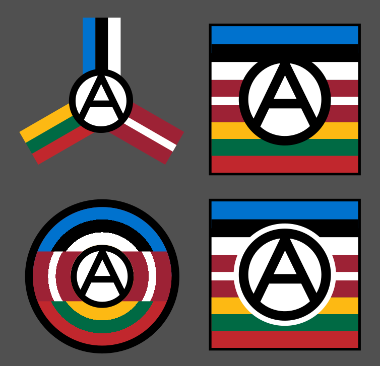
Good shout! Making the A black really made the circular one pop. I think it even made the tri-angle work, although that may have just been from having removed the background.
Interesting, but smells a lot like branding, commercialization, and capitalization.
It is branding. Anarchist movements need branding just like any movement. It's how messages spread and people join. The circled A, 1312, The Black Cat; All of these are part of the anarchism brand.
A brand isn't inherently commercial. It's only when you start selling it, and selling anarchism isn't inherently bad as well people need money to survive and if you can make it while also spreading an ideology why shouldn't you.
The problems start when you start using authority to sell things, thus acting completely opposite to the message you are spreading, as long as you make the branding/products yourself it's still anarchy.
you sound very confused.
Why do you say that? I could speculate but I'd rather not waste time answering questions no-one has and guess what you meant by this.
You missed the opportunity to make the strokes of the A be the flags.
I feel like that would make the A too colourful. The circled A is a single symbol. making the A have other meanings conflicts with the simplistic focus of it.
But if you leave A blank, it becomes a unifying feature and means that this is something that transcends flags and cultures.
The idea is nice, the realisation is good too. But boring and uninspiring. I feel like I saw something similar a million times already, covering a thousand different themes.
I think this is always a problem when trying to make widely understandable visuals. Because everyone knows how to make quickly understandable visuals they become overused. When trying to make something unique you end up with something that's confusing or overly complex. The ACABB poster is a prime example of something that tries to be unique but ends up so noisy that you can't really understand what's going on: https://acabb.noblogs.org/files/2025/08/acabb-poster-v1.pdf especially if it's in black and white.
I could use the borders but that feels conflicting the anarchist "no borders" ethos. The only reason I used flags is to signify the cultures and peoples of the region, not the states. Although I guess you won't really think about that.
The problem is that I need a visual indicator for the Baltic region that isn't based on the states, but rather the people.
I'm loving the bottom left. The black border around the circle-A gives it a sense of prominence that is lost on the version above it.
I find the right side is getting a bit too messy in terms of readability, and don't read as flags. The middle is okay, but I think it would only look good on a transparent background and probably wouldn't scale down very well.
Is this a redesign for an LGBT Captain America? 😅