this post was submitted on 04 Jan 2026
82 points (91.0% liked)
Anarchism
2954 readers
3 users here now
Discuss anarchist praxis and philosophy. Don't take yourselves too seriously.
Other anarchist comms
- !anarchism@slrpnk.net
- !anarchism@lemmy.blahaj.zone
- !anarchism@hexbear.net
- !anarchism@lemmy.ml
- !anarchism101@lemmy.ca
- !flippanarchy@lemmy.dbzer0.com
Join the matrix room for some real-time discussion.
founded 2 years ago
MODERATORS
you are viewing a single comment's thread
view the rest of the comments
view the rest of the comments

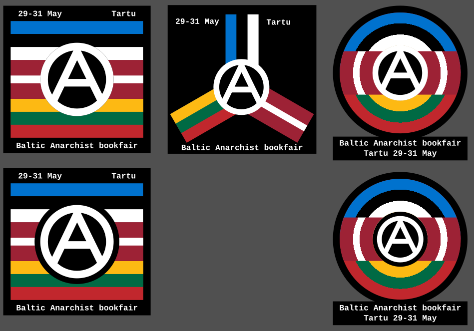
It's interesting for sure, but the A is very glaring. Making the border around the A bigger certainly improves it but then it starts covering up quite a lot of the flags. It also feels quite generic, I know the other ones are generic as well but this one just feels like "Take the flags and put an A over it." done.
I see what you mean. In that case take the one on the lower right of your original set.