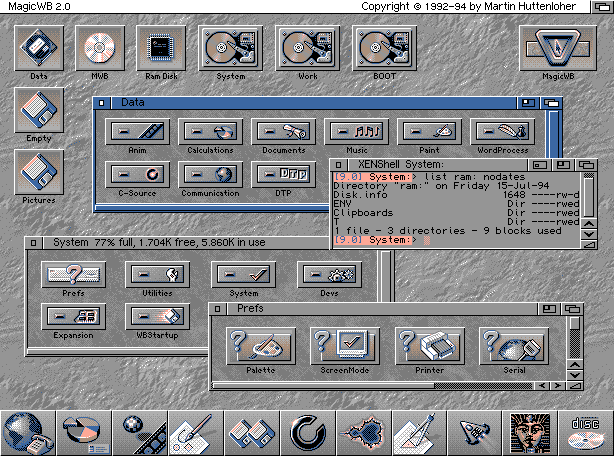
The looks of the UI were never bad at all. There were other problems:
- The larger distance between icons made it worse for cursor users. Specially for trackpad. But this is just a tradeoff, as it made it better for touchscreens. Also, this is the only problem with the design.
- Laggy context menus and overall slow animations
- This made it objectively worse for all mouse users
- The method to access a list of all applications was also undesirable
- No easy access to exit options
- one of the versions I had to use, didn't exit to desktop on
Esckey. - Where do you find the Shut Down button? I actually started using the terminal to shutdown the computer on these systems.
- one of the versions I had to use, didn't exit to desktop on
There was a similar looking UI in Windows Phone and it worked pretty well for me. I actually liked that one more than the Android UI. So, in this case it really was the substandard execution.

