This whole "manual" is like this. No idea how they managed to screw up so bad
Kerning is the typographic term for the spacing between letters or characters in a piece of text to be printed.
Keming is what it looks like when you fuck up the kerning.
This whole "manual" is like this. No idea how they managed to screw up so bad
Quite easy. Produce a PDF with non-standard fonts, but don't embed them. Whoever opens it without those fonts installed will see glyphs from an installed default font, positioned where the glyphs of the original font would have been.
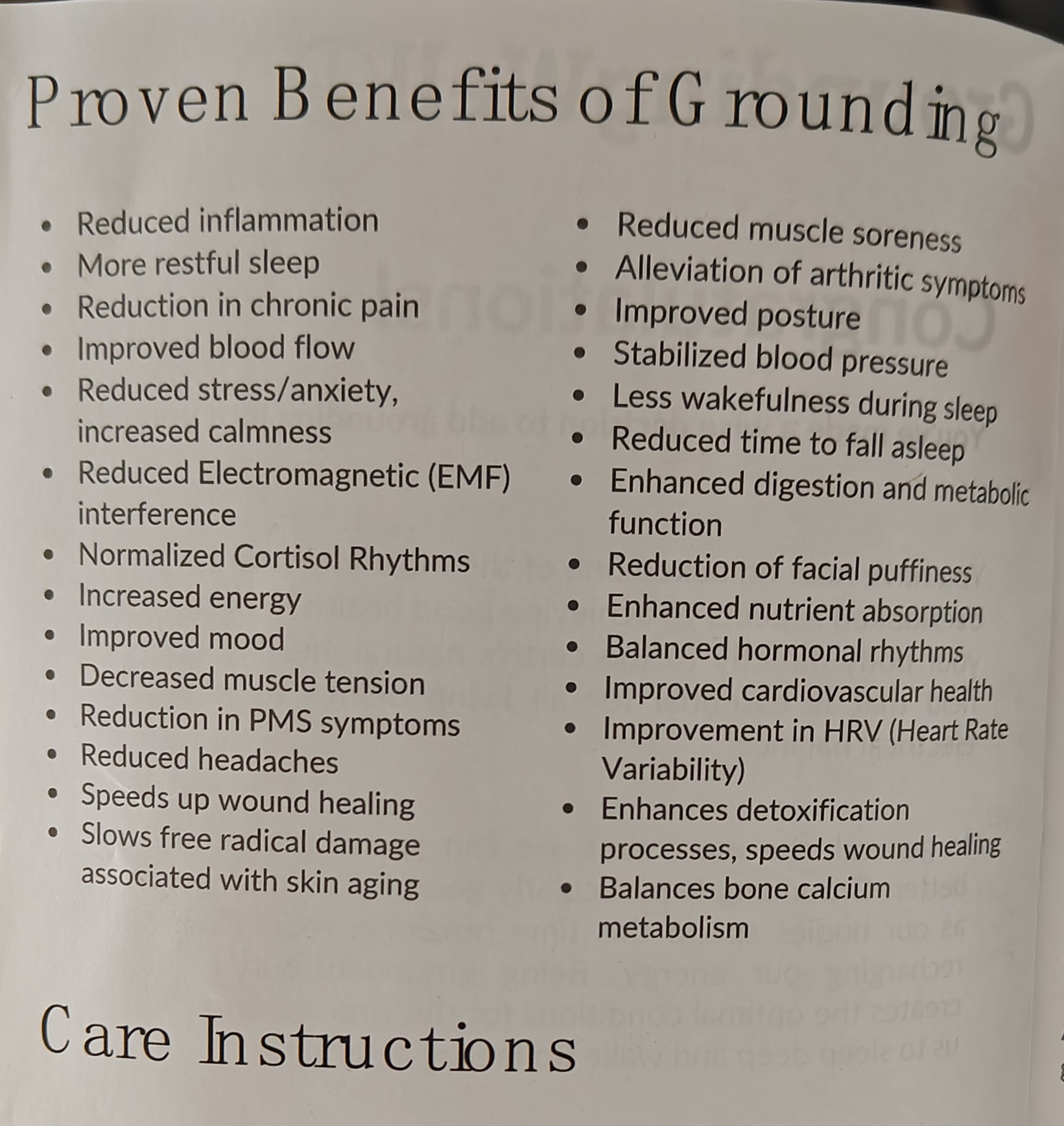
Just pointing out that a product that claims it can cure everything usually can cure nothing at all. That's a crazy long list of benefits, first clue it's snake oil.
Electroboom recently published a video on the snakeoil of grounding products like these.
Oh.. ooooh. That grounding. I was thinking about "no Jimmy, you stay in your room with no phone or console for the next two weeks."
Can you link it? I tried looking for it but I can't find the video.
I have one of them myself, but that's for assembling PCs
I'm barefoot most of the time and my posture is terrible. Grounding is snake oil, confirmed.
This has happened to me when using older versions of LibreOffice on RHEL.
Maybe it was the bad font in RHEL, or maybe it was some old bug that got fixed later.