Keming

137 readers
1 users here now

Kerning is the typographic term for the spacing between letters or characters in a piece of text to be printed.

Keming is what it looks like when you fuck up the kerning.

founded 2 years ago
MODERATORS
1


cross-posted from: https://suppo.fi/post/9183817

A sophisticated phishing campaign is currently leveraging a subtle typographical trick to bypass user vigilance, deceiving victims into handing over sensitive login credentials. Attackers utilize the domain “rnicrosoft.com” to impersonate the tech giant.

By replacing the letter ‘m’ with the combination of ‘r’ and ‘n’, fraudsters create a visual doppleganger that is nearly indistinguishable from the legitimate domain at a casual glance.

This technique, known as typosquatting, relies heavily on the font rendering used in modern email clients and web browsers.

2
 
 
3


I make no opinion on the Catholic faith or the Pope, but this just seems unusually lazy to mess up on such a high profile commission. No one spotted this before unveiling??

4
38
submitted 9 months ago* (last edited 9 months ago) by threelonmusketeers@sh.itjust.works to c/keming@lemmy.world
 
 
5
6
13
submitted 1 year ago* (last edited 1 year ago) by donuts@lemmy.world to c/keming@lemmy.world


This whole "manual" is like this. No idea how they managed to screw up so bad

7
8
submitted 1 year ago* (last edited 1 year ago) by litchralee@sh.itjust.works to c/keming@lemmy.world


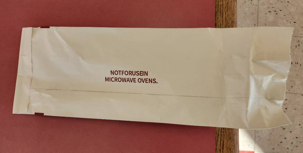
Notforusein is a perfectly cromulent word. Or a brand name for sale on Amazon.com.

EDIT: this is a take-out bag for sandwiches, where the inside is apparently lined with aluminum to keep the heat in. Accordingly, they do not recommend the bag to be placed in a microwave oven.

8
1
Then you hard. (lemmyf.uk)
submitted 1 year ago* (last edited 1 year ago) by threelonmusketeers@sh.itjust.works to c/keming@lemmy.world


Edit: Apologies for the repost. I should have federated the community before posting.

9