That is common in east Asia in general, and I don't see why not 🤷
This is for strictly mildly interesting material. If it's too interesting, it doesn't belong. If it's not interesting, it doesn't belong.
This is obviously an objective criteria, so the mods are always right. Or maybe mildly right? Ahh.. what do we know?
Just post some stuff and don't spam.
That is common in east Asia in general, and I don't see why not 🤷
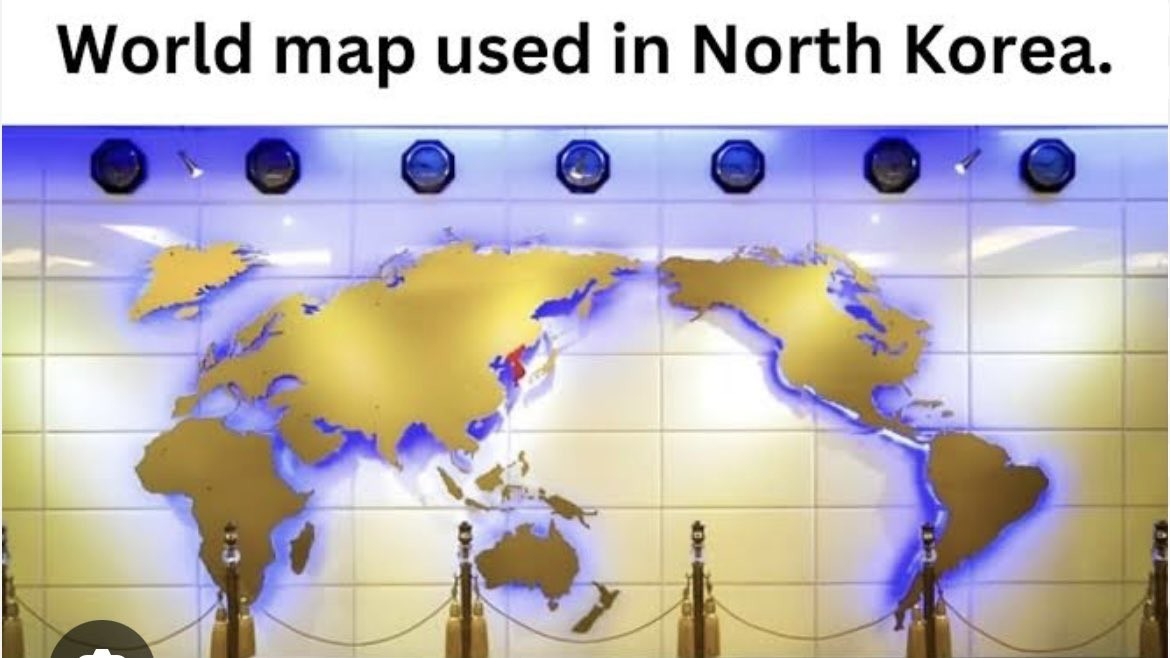
And it has New Zealand on it!
Exactly, no one here played Street Fighter 2 on SNES?!
What do you mean america is not the center of the universe?
Fun fact: Whether North or South are "up" on a map is also completely arbitrary.

They undercut the message buy putting upside down at the top.
I had a teacher in high school who always set his globe that had the text oriented to the nearest pole to have the south pole on top. Anyone switching it would start a conversation about how there isn't a 'correct' up direction.
There is only a "correct" up direction if it has words. The "correct" up would be the direction of the letters.
Oh god why Mercator?
Mercator really starts to shine when you rotate it by 90 degrees.

This is cursed enough to be an SCP
At this point, Africa is almost represented at its actual size.
Or left right

Should have rotated the other way so the sun scrolls satisfyingly top-to-bottom.
Yeah, but European borders aren't
Sure they are, they're fun to redraw too. I thought y'all loved doing that
This looks like a fantasy world map wtf.
It’s freaking me out!
Most maps in Asia are like this. That’s why growing up I was confused why the US was called the west and East/Southeast Asia was called the far east.
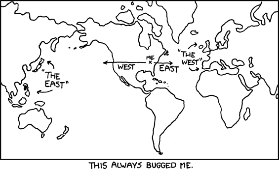
edit: Oops, didn't realize the credit wouldn't be obvious. It's xkcd #503.
I guess it kinda makes sense if you draw the line right down the middle of Germany. Weird, I wonder if there's any historical precedent for that...
Its almost as if some country thinks they are the center of the world.
Well, specifically a couple of countries on either side of the Atlantic.
It’s more like most countries. Maps like the one shown in this post that place Asia as a central focus are common in Asia.
Maybe it’s not national narcissism, rather just focusing on what’s most relevant to any one people.
I think putting the line down the Pacific makes the most sense in most cases. But the national narcissism has historically been a defining characteristic of the UK and the US
They included New Zealand.
They're already leagues ahead of most US primary education text books
Maps with New Zealand.
And Tasmania!
At least it has New Zealand.
Don't the rest of the countries in the region use similar maps? South Korea, Australia, Japan...? I would expect that to be the case, it seems more natural.
Yes, and Australia even has it as upside down.
They've not discovered Antarctica yet
I like it, if only because it places Oceania at the center. They're always pushed aside and it's big sad.
Sea of Thieves lookin' map.
Projection aside, proportionally it's a bit whack and Japan is a bit too far north. Taiwan also seems to be inexplicably MIA, which would be understandable if it were omitted due to size but there are several smaller islands still depicted.
Perhaps the real point of interest is that it seems to depict the North and South Koreas as united with the whole peninsula colored in red. As usual for the Juche Boys, this is probably a tacit threat rather than any indication of potential armistice or reconciliation.
They do this petty, embarrassing shit all the time on their maps. Made it look like Japan smaller while simultaneously peninsula bigger. And this is not just from north but south too lol
It makes sense they’d centre the Gulf Of Korea though.
There is no North Korea in North Korea. There is only Korea.
Nerd sniped me enough to look it up. Both countries use different names for "all of korea." While the north generally refers to itself with the same term as all of korea, there are some contexts where there is a "north Korea" used.
Nerd sniped me
~~The fuck's wrong with you?~~ (I guess that wasn't directed at me)
Look at the pic, all of Korea is red.
Sorry if I didn't explain it well. What I mean is that dprk considers itself the "true" government of the Korean peninsula, and their terminology generally reflects this. Due to the functional reality of the ongoing conflict, "South Korea" is used often. Though it's used rarely, "North Korea" (literally north, functionally "unoccupied" or "free") does still show up occasionally in language.
The oddest part for me is Greenland being split from the Americas
I mean politically speaking it's Danish, so I suppose it makes sense to group it with Europe in some ways.
It does look a little odd though.
At first this map seemed perfectly fine to me, but the more I look the weirder it gets.
They also claim South Korea.
Seems odd to me to want to put the largest ocean in the world as the focus. Yes, let's put most of the useful information around the edge of the map. Brilliant idea.
Let's draw maps with Antarctica in the middle instead.
That's just the back of the UN logo
north korea is pretty lose to center on the map.
Looks good to me. I've also seen pics showing they can change the colors.