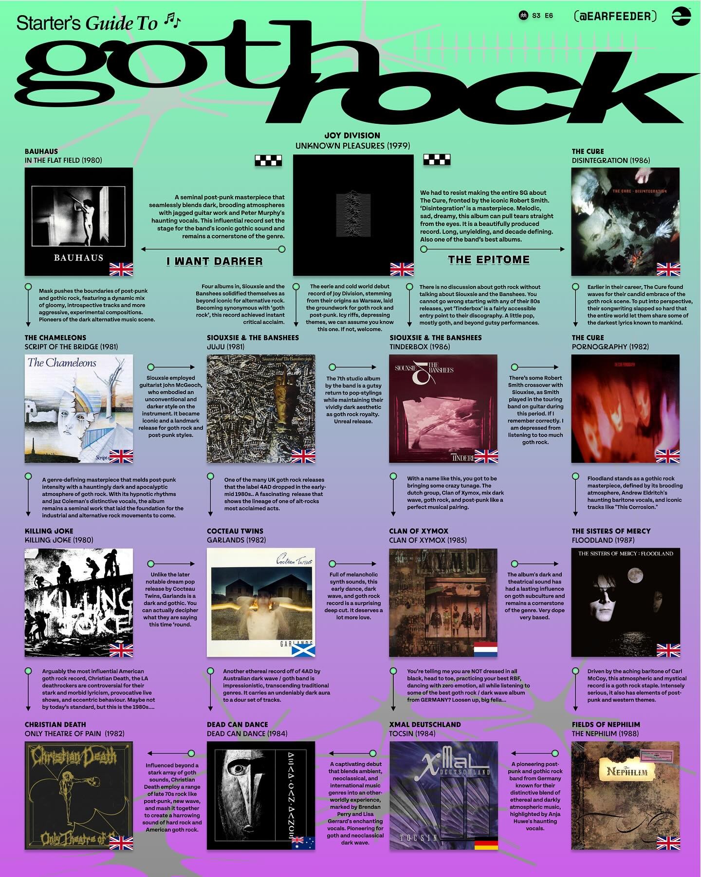
The layout of this guide is terrible - it's hard to tell what text goes with what album - but the suggestions are solid.

An inclusive community for discussion of all things
📢Treating the labels with very broad strokes here, don't hesitate to post.
Share anything you've discovered that tickles your hardware. New Releases, or any upcoming relevant event information you find!
If you are an artist, feel free to self promote within reason.
📢This community will not accept or tolerate any forms of bigotry, including (but not limited to) sexism, homophobia, racism, xenophobia, transphobia, ableism, ageism and classism.
💀💀💀💀💀💀💀💀💀💀
RELATED COMMUNITIES
!postpunk@lemmy.world
!industrialmusic@lemmy.ca
!goth@lemmy.ml
!nin@lemmy.world
!funeraldoom@lemmy.world
!vampires@lemmy.zip
!cyberpunk@lemmy.zip
!witchymemes@lemmy.world
!bats@lemmy.world
🌑🌒🌓🌔🌕🌖🌗🌘🌑
The layout of this guide is terrible - it's hard to tell what text goes with what album - but the suggestions are solid.
ooohh... you're right... that explains wat they were going for...
tho the Joy Division text doesn't have any arrows. And the top says "I Want Darker" as if it IS a flowchart. The more I look at it the crazier this becomes: the colors, the background graphics, the fonts, they make no sense given the subject matter. I suspect this was put together by a clueless rando who picked the albums from a far superior source.