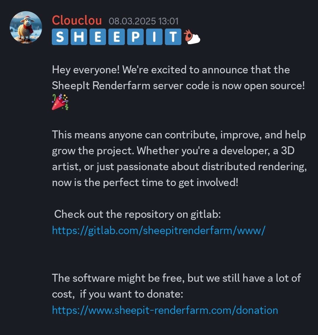
What is the point of this logo?
It's not readable at a glance and misspelled. If that was the point then good job.
If it wasn't, then you can learn from your mistakes.
What is the point of this logo?
It's not readable at a glance and misspelled. If that was the point then good job.
If it wasn't, then you can learn from your mistakes.
Wait…
That orange swirl on her head isn't a head accessory but an eye?
New lore just dropped.
Please, draw her at the time when she discovered the orange swirl.
Hmmm…
Time travelling thread from AD 2024
Do you drink milk?
Thanks, I have done exactly that. (root password)
Draw her drawing herself.
In the Lemmy link provided it's not embedded, it's just linked.
What fronted/app are you using?
Open a github issue if you believe it should be done.
There was one already. https://github.com/mastodon/mastodon/issues/7211
Things that helped me:
Books:
YouTube channels:
For books check this link aggregator for piracy sites
Client and Shepard code was already open source.
stolen from a thief: https://wetdry.world/@nonfedimemes/114139775344654173


I wasn't precise with the point. Where should the logo be put? Laptop or webpage?
Different usages require different levels of speed of comprehension.
The horizontal lines, the colors and contrast help hide the different spelling of the first world. They all don't convey a singular meseege.
In my non-expert opinion the first
ishould be in regular pride flag as second one is misspelled and should be highlighted. There is also problem of misreadingFintoEdue to horizontal stripes.Side note. Different therapy in my view is "Conversion Therapy" and I don't think that is your point.