Sieht ganz schön aus! Eine feddit-Referenz passt nicht drauf, oder?
Sieht ganz schön aus! Eine feddit-Referenz passt nicht drauf, oder?
Waah ich hab’s verpasst, meine -42 Tabs tauchen in der Statistik nicht auf 🙈 hammer Auswertung! 🔨
✨NEU✨ ab sofort mit 50% weniger Inhalt!
Die kleineren Portionen führen hoffentlich dazu, dass weniger Leute die überzuckerte ungesund Scheiße fressen, die Dr Oetker verkauft.
Naja wenigstens zahlen sie ja ihren gerechten Anteil an Steuern. Oder? Oder?
Absolutely gorgeous, thanks for sharing!
Größter Schock meines Lebens war beim Dönermann im Pott: „Kräutersoße haben wir nicht, willst du Tzatziki?“ Musste notgedrungen auf Currywurst umgleisen 😖
Geldstrafen sind ungerechte Strafen, die vor allem Arme bestrafen. Armin macht als Abgeordneter 11.000€ brutto. Die 450€ sind 4% seines Bruttomonatseinkommens. Der könnte im selben Monat noch 5x mit 100 durch die 50er Zone fahren, und würde es im Geldbeutel nicht merken.
🥳🍾
I am a bit too dumb to understand that graph and asked ai for an explanation. It helped me, maybe it also helps others:
This graph comes from a study by Gilens and Page that examines how different groups influence U.S. policy decisions. It has three separate charts, each showing how policy adoption (whether a policy is enacted) relates to the preferences of different groups:
1. Average Citizens’ Preferences (top chart)
2. Economic Elites’ Preferences (middle chart)
3. Interest Group Alignments (bottom chart)
Breaking It Down:
• X-axis:
• In the first two graphs, it represents how much each group supports a policy (from 0% to 100%).
• In the third graph (Interest Groups), the x-axis shows alignment, with negative values meaning opposition and positive values meaning support.
• Y-axis:
• The left y-axis (dark line) shows the predicted probability of a policy being adopted.
• The right y-axis (gray bars) shows how often different levels of support occur in the data (percentage of cases).
Key Takeaways & Surprises:
1. The top chart (Average Citizens) is nearly a flat line.
• This means that whether the general public strongly supports or opposes a policy has little impact on whether it gets adopted.
2. The middle chart (Economic Elites) has a rising curve.
• This suggests that policies supported by the wealthy have a much higher chance of being adopted.
3. The bottom chart (Interest Groups) also shows a strong upward trend.
• The more interest groups align in favor of a policy, the more likely it is to be adopted.
Big Picture:
This graph suggests that the opinions of average citizens have little to no effect on policy decisions, while economic elites and interest groups have significant influence. This challenges the idea that the U.S. operates as a true democracy where the will of the majority decides policy.
Ich will nicht lügen, das ist ein ziemlich mieses Maimai. Aber auf die Aussage können wir uns einigen 🤝
Der liebe notastatist hat in Ägypten gegraben und mir ein göttliches Wichtelgeschenk auf Papyrus gemacht. Im Zentrum ist Königsgemahlin Metertari zu sehen. Hab herzlichen Dank 🙏❤️


cross-posted from: https://lemmy.world/post/15745137
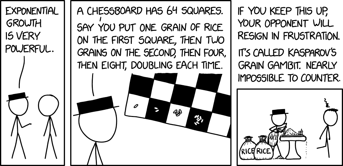
xkcd #2936: Exponential Growth
Alt text:
Karpov's construction of a series of increasingly large rice cookers led to a protracted deadlock, but exponential growth won in the end.
The Spanish capital boasts a long and unique tradition in menswear, particularly in footwear. Despite Spain's declining production of footwear over the decades, with much of it moving to Asia, Madrilenians still uphold a strong preference for high-quality leather shoes. The zapaterias, as the Spanish call their shoe shops, are concentrated in the old town, around the historical shoemaker's quarter in Caille de Toledo. However, they are omnipresent throughout the city and hard to miss. Let me show you four of my favorite zapaterias in Madrid.

Let's start by exploring the Spanish all-star-shoe, the "Pisamierda", which roughly translates into "sh*t stomper". These shoes, in design similar to Clark's Desert Boots, can be found in almost every Spanish household due to their affordable pricing. For instance, LOBO, a shop in Calle de Toledo, sells a pair made of suede for around 30 EUR link. It goes without saying that you should treat them with water repellent spray right after the purchase and avoid wearing them in moist conditions whenever possible - the suede is unforgiving.

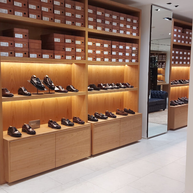
On Calle Claudio Coello in the upscale Salamanca neighborhood, you'll discover a shop belonging to the Spanish brand Meermin. The shop is nice and spacious, with a small but nice inventory of boots, loafers and oxfords. The service is friendly, and they offer goodyear welted leather boots made of French calf leather for 200-300EUR per pair. Take a look at the image above to get an idea of what I'm talking about, or look through their webshop. While the price is fantastic, be aware of the increased variance in the shoe's quality. During my visit, I observed shoes with scratches in the leather and uneven stitching that were on display for sale. I recommend that you take your time to carefully inspect the pair of shoes that you're about to buy. If you do, you might score a pair of shoes that might otherwise cost you double at places like Redwing.
Berwick also sells shoes in Salamanca, on Calle de Hermosilla. The company, with two brick-and-mortar stores in Spain and one in Korea and Japan, offers a broader selection compared to Meermin. They specialize in goodyear welted constructions, and mostly use thick calf leather for their shoes. A pair of boots will cost you about 250EUR. Personally, I found the quality of shoes sold at Berwick to be superior to what I observed at Meermin, with less noticeable flaws. I highly recommend the destination.

In a league of their own are Tubet Zapateros in Caille de Núñez. While the vendors at Meermin and Berwick are nice and helpful, the staff at Tubet Zapateros takes it a step further. They will listen to your preferences, provide a selection of shoes for you to try on, and even put the chosen pair on your feet while sharing information about the craftsmanship. Tubet Zapateros stocks high-end brands like Allen Edmonds, Alden, Crockett & Jones and Carlos Santos. Be prepared to spend at least 300EUR for a pair of oxfords and at least 400EUR for a pair of boots.
Ok ja ist passt, es gefällt! 😎