4
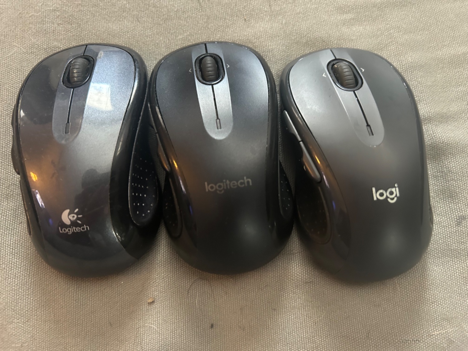
I lost my mouse a couple times and bought an exact replacement, then found the old one. You can see the evolution of the logo
(lemmy.world)
This is for strictly mildly interesting material. If it's too interesting, it doesn't belong. If it's not interesting, it doesn't belong.
This is obviously an objective criteria, so the mods are always right. Or maybe mildly right? Ahh.. what do we know?
Just post some stuff and don't spam.
Logitech is a good name for computer peripherals. Logi sounds like underwear or something.
To be fair, the company name is still Logitech, just the logo is shorter. I agree that the middle is probably best aesthetically, except that the logo seemed to fade quickly.
You can see the logos getting worse, in my opinion. I absolutely hate the trend of oversimplifying logos.
Soon it will be "log", then "lo", and finally "l".
The big L
Cool find, thanks :)
Cool find, thanks :)
What about this find makes it cool?
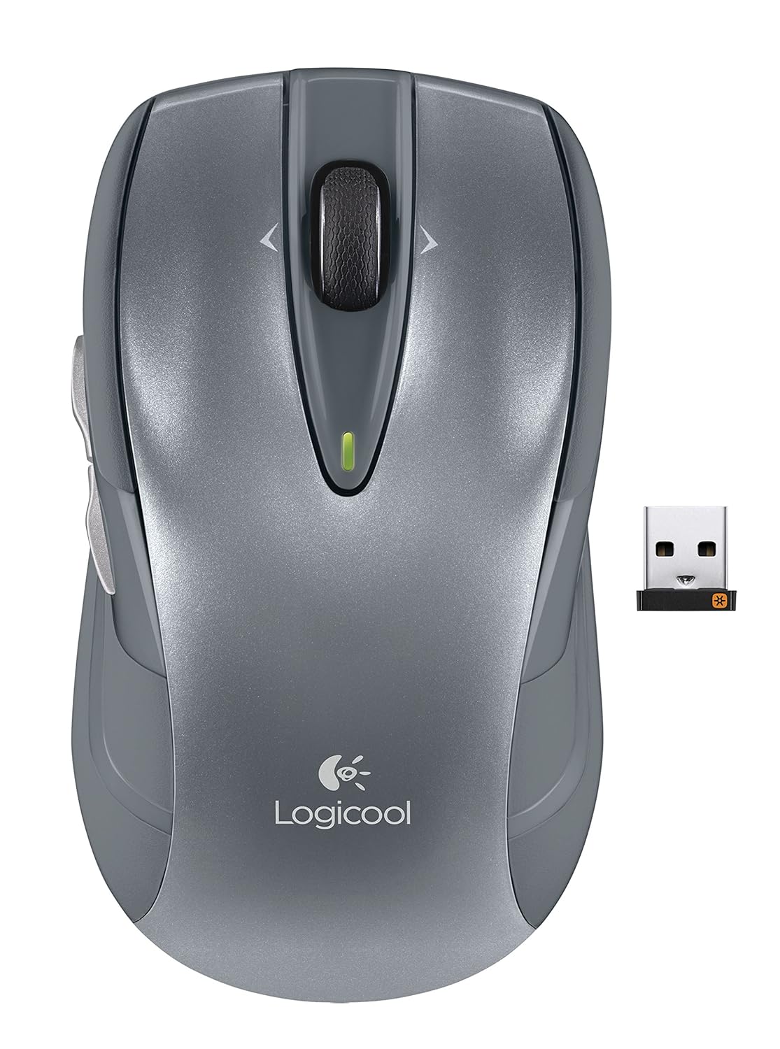
Note: not a photoshop. That's how they were branded in Japan. Presumably the new Logi logo is to unify their branding.
ad remove