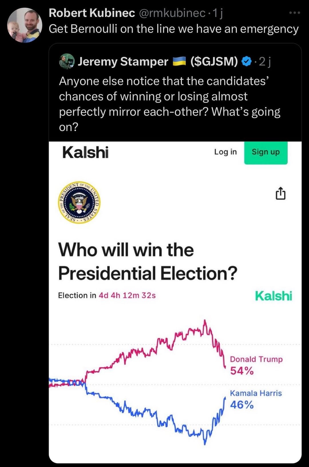
I feel like there was probably a better way of graphing this tbh
this post was submitted on 04 Nov 2024
10 points (100.0% liked)
Math Memes
3704 readers
61 users here now
Memes related to mathematics.
Rules:
1: Memes must be related to mathematics in some way.
2: No bigotry of any kind.
founded 2 years ago
MODERATORS
Stacked area has to be better than this right?
What kind of graph is this?
Buttplug of best fit
I think it’s just a plain Jane line chart right? The reason it looks like this is because the two lines are n and 100%–n.
You might be thinking of a population pyramid chart which looks somewhat similar to this if it were rotated 90°
Where is this chart from?
Polymarket, probably. Probability market, i.e. betting site.
