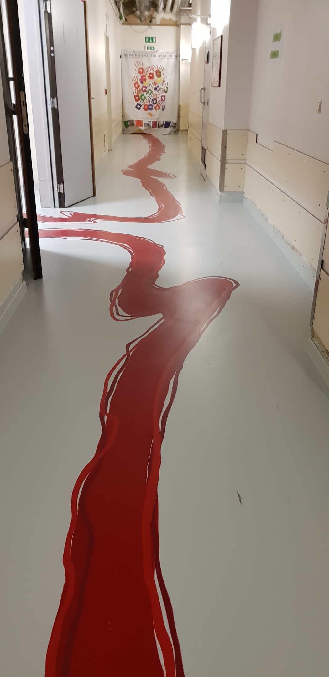
At least the walls are not painted green.
Crappy Design
Noticed that theres no equivalent to r/crappydesign here yet so i made one
It's an awful decision!
I've seen a similar design fail at a veterinary kennels - super Gucci, super nice, super high tech... but useless because a deep scarlet was used as a kennel floor paint. For the sickest of dogs (in the health sense, not busting 900's in a doggy daycare halfpipe) - one of the first signs of serious illness is blood being left from one or more orifices in the kennel after a set amount of time. The nature of the floor meant that this couldn't be seen at first glance.
Same thing with black latex gloves - they might make you feel like you're about to pull of a diamond heist, it they're a bit shit for medicinal use as a medic or first responder can't check for (or otherwise notice) hidden blood or leakage during an initial survey.
Interesting stuff if you ever get to work beside those sorts of folks.
It's supposed to be paint, like for a kid's wing.
I like the design. Red is just a poor choice. Purple, Green, Orange, Cyan, Pink, and this would look really good.
I hope other parts of the hospital use other colors and this is just the only unfortunate hallway.
Why are the walls so bare?
The dying hand prints I the far wall are a nice touch! They probably need more, you're right.
