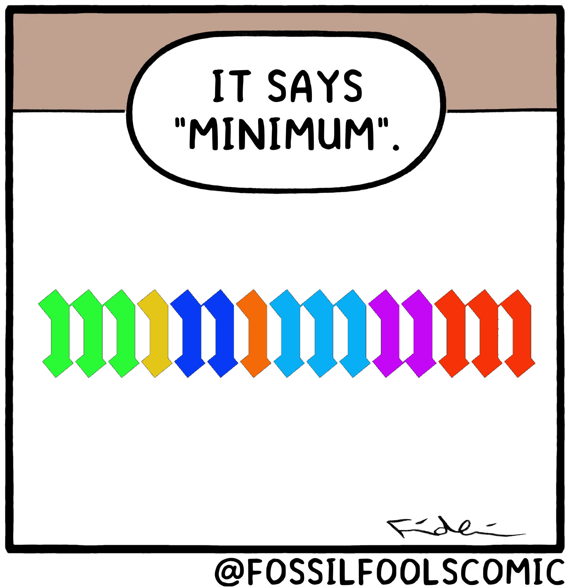
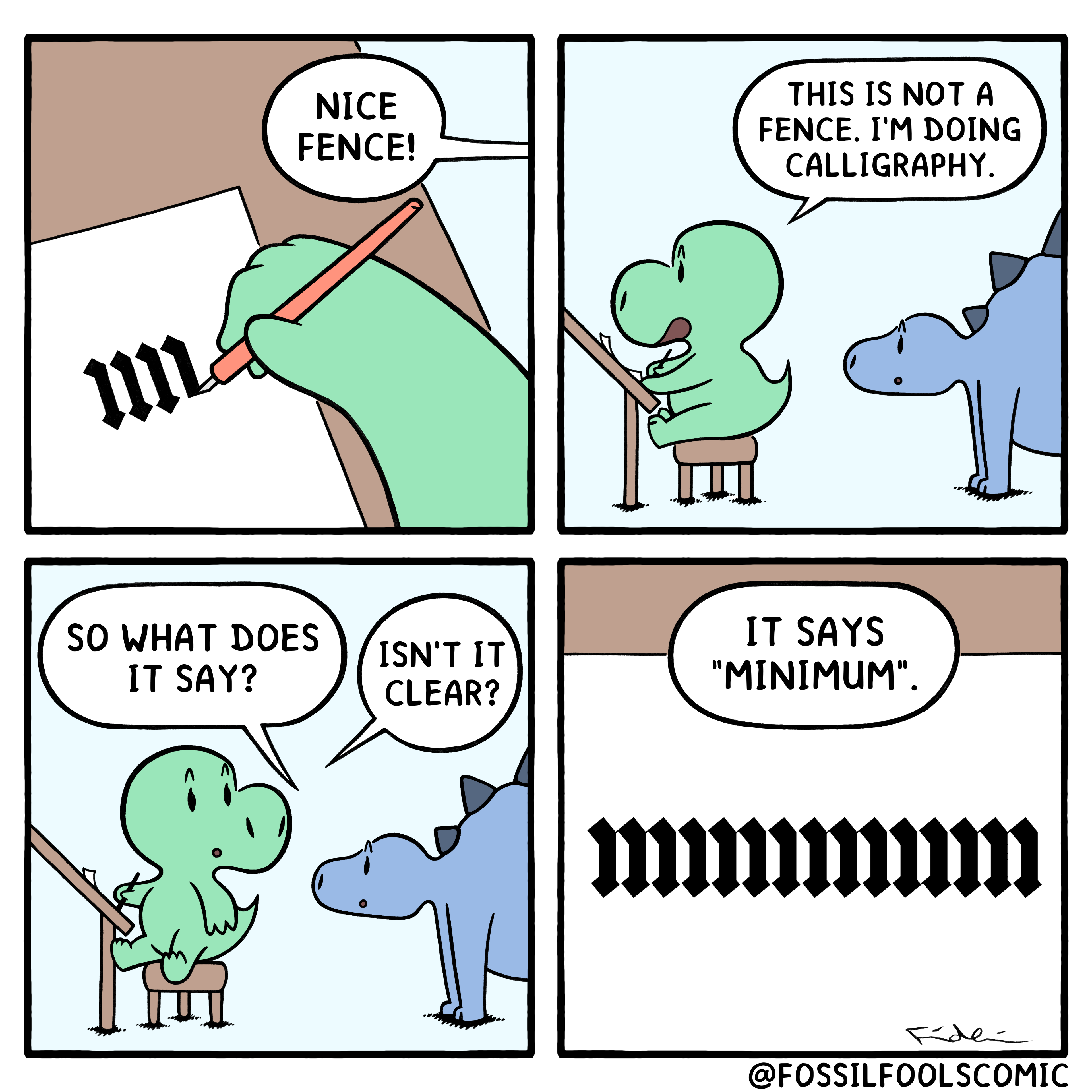
After like 5 tries and squinting and using my finger to block lines as I went along, I managed to verify for myself that it does in fact have the proper amount of lines.
Comic Strips
Comic Strips is a community for those who love comic stories.
The rules are simple:
- The post can be a single image, an image gallery, or a link to a specific comic hosted on another site (the author's website, for instance).
- The comic must be a complete story.
- If it is an external link, it must be to a specific story, not to the root of the site.
- You may post comics from others or your own.
- If you are posting a comic of your own, a maximum of one per week is allowed (I know, your comics are great, but this rule helps avoid spam).
- The comic can be in any language, but if it's not in English, OP must include an English translation in the post's 'body' field (note: you don't need to select a specific language when posting a comic).
- Politeness.
- AI-generated comics aren't allowed.
- Limit of two posts per person per day.
- Bots aren't allowed.
- Banned users will have their posts removed.
- Adult content is not allowed. This community aims to be fun for people of all ages.
Web of links
- !linuxmemes@lemmy.world: "I use Arch btw"
- !memes@lemmy.world: memes (you don't say!)
It's not just the correct amount of lines but connections between the lines are actually there, if they should be that is, if you look closely.
Oh shit you’re right
Wow. You really had to zoom in for that one. +2 to the artist for such attention to detail.

calligraphy has a patron demon, not a patron saint
Titivillus has also been described as collecting idle chat that occurs during church service, and mispronounced, mumbled or skipped words of the service, to take to Hell to be counted against the offenders
Damn..that narc needs to RELAX 😆
he has an entire cult of followers, its hilarious.
(I probably just triggered them all.)
When you say "an entire cult of followers", do you actually mean a handful of the weirdest dudes in the Vatican?
oh... no. I mean hordes of slathering buffon's who jump on social media posts with typos.
(ooops. I did it again.)
Is this how calligraphy looks to people who can't read cursive?
Keming
Reminds me of Russian handwriting. Always funny to show foreigners.
