I see USA, Hungary, and Poland up there pretty high. I wonder if Russia has anything to do with that.
Be respectful
I see USA, Hungary, and Poland up there pretty high. I wonder if Russia has anything to do with that.
Definitely
God if only there were a way to plot x by y on two independent axis...
axes
Well I don't see how you would be able to tell which dot belongs to which country. I would like a scatter plot, but it appears the authors want to tell a different story
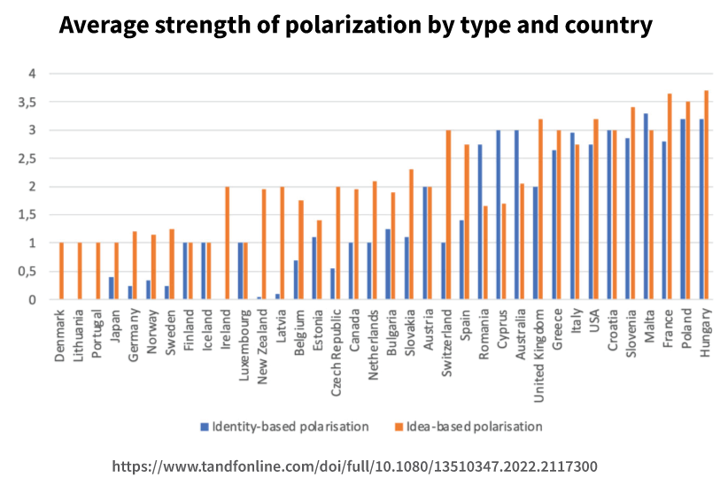
Link https://www.tandfonline.com/doi/full/10.1080/13510347.2022.2117300#abstract
Definition of concepts from abstract:
Political views, opinions, and worldviews become increasingly irreconcilable (idea-based polarization), while at the same time society appears to be getting fractured in antagonistic, opposing camps (identity-based polarization).
I'm not sure how it is actually measured. It is from the v-dem dataset. Is that questionaire data?
What does this mean?
How does one read this chart?