Just noticed that Stackoverflow has a new front end in Beta. I do not like it, however I slowly begin to fear im just another boomer. :( What do people on here think about it?
I think the beta looks just like any other weekend project with cookie cutter elements. There is nothing to differentiate it from other sites that are made after 2020. Current design is also way more concise Im not sure when we started using the whole widescreen for a website. Sure wasted screen estate is unfortunate but long mouse travel times are also uncool.
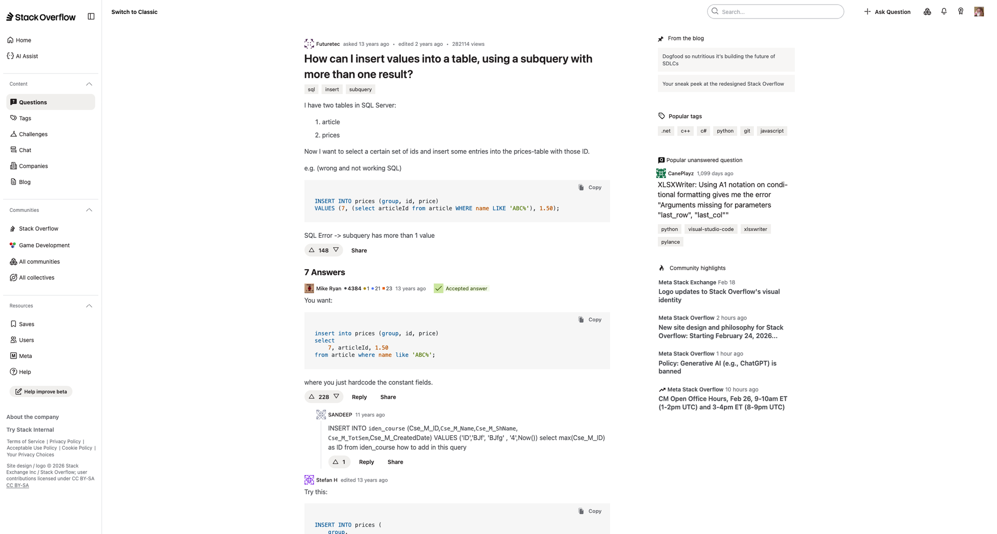
Screenshots of both:
| "Classic" | "New" | |
|
| | |
|  |
|
Well, you can see I use dark color scheme, which apparently got lost. Make a guess how much better I like that.
It's not my full monitor width because of vertical browser tabs, but even then the horizontal distance between left nav bar and top right nav toolbar is horrendous.
The spacing is wasteful, the sizing is unnecessarily big.
It's worse in every way. Less accessible, less readable, less scannable, less overview.
I wish they would simply drop their new design draft completely.
For anyone visiting the site thinking "looks like before for me" like I did, at the top there's a link to "try out the new site".
Their blog post, research blog post, previous community feedback, feedback form.
I really don't understand why they even did that? Guess the web devs got too bored while the current one worked too well, but that should have maybe been a sign to keep your hands from it.
You don't even need to be a designer to see how it looks worse even if you are not able to point out what exactly is wrong.
Especially do not get why they got rid of the borders for the sake of minimalism. It adds so much unnecessary mental overhead.