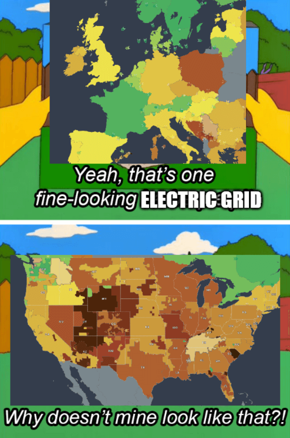
Source - The colors of the grids represent CO2 emissions
The title is a reference to the 2021 Texas power crisis
1. Be civil
No trolling, bigotry or other insulting / annoying behaviour
2. No politics
This is non-politics community. For political memes please go to !politicalmemes@lemmy.world
3. No recent reposts
Check for reposts when posting a meme, you can only repost after 1 month
4. No bots
No bots without the express approval of the mods or the admins
5. No Spam/Ads/AI Slop
No advertisements or spam. This is an instance rule and the only way to live. We also consider AI slop to be spam in this community and is subject to removal.
A collection of some classic Lemmy memes for your enjoyment
Source - The colors of the grids represent CO2 emissions
The title is a reference to the 2021 Texas power crisis
These are not synchronous grids, but some other kind of boundaries. With synchronous grids the US should be split to only 3 zones, and most of Europe would be colored the same. So I think the kind of map you used is not the best for this joke.
World map of all synchronous grids:.png)
From the website it sounds like that is a map of electric companies or something like that. So this map is not directly related to the Texas crisis. Most of these companies share electricity between each other.
Tom Scott video about synchronous grids: https://www.youtube.com/watch?v=bij-JjzCa7o
More info: https://en.wikipedia.org/wiki/Wide_area_synchronous_grid
I like how there is this giant Russian-Belorussian-Georgian-Azerbajanian-Kaxah-Uzbeki-Tajikistans-Kirgizian grid.
Who said something about USSA being "too big"?