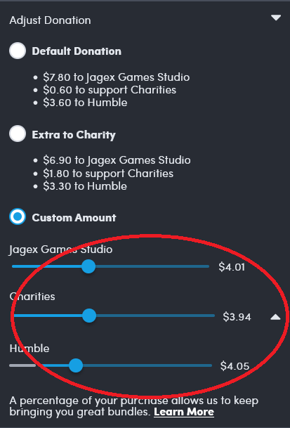
The amount going to Humble is the most, even the the Humble slider is the lowest.
This is a community for designs specifically crafted to make the experience worse for the user. This can be due to greed, apathy, laziness or just downright scumbaggery.
The amount going to Humble is the most, even the the Humble slider is the lowest.
Regardless of if this is intentionally designed to be misleading, a stack of sliders is the wrong way to show portions of a whole. I wonder what a better way would be for the web? A single slider with multiple knobs? Or like a single stacked bar with draggable boundaries between sections? I bet you could accomplish that with multiple sliders and some CSS to make them look like a single thing
Just checked the website. Your interpretation (and nine) was incorrect.
The publishers and charities sliders and connected, so they split up a total between the two. The Humble slider is independent (or connected to a referral in a similar way).
There should be some kind of separation here. I’d go so far as to say there should be a text explanation.
The other issue is that they’re absolutely no indication that spiders can affect each other, when using a screen reader. There’s no feedback for a slider you’re not adjusting.