translation: There are people conjuring thoughts like "I've seen one too many brown people".
Also unsurprising where the sentiment is coming from:
srcs:
- https://www.ipsos.com/en/perils/perils-perception-prejudice-and-conspiracy-theories-0
- https://ourworldindata.org/data-insights/many-people-overestimate-the-percentage-of-immigrants-in-their-country
More imbecility (from the same src):
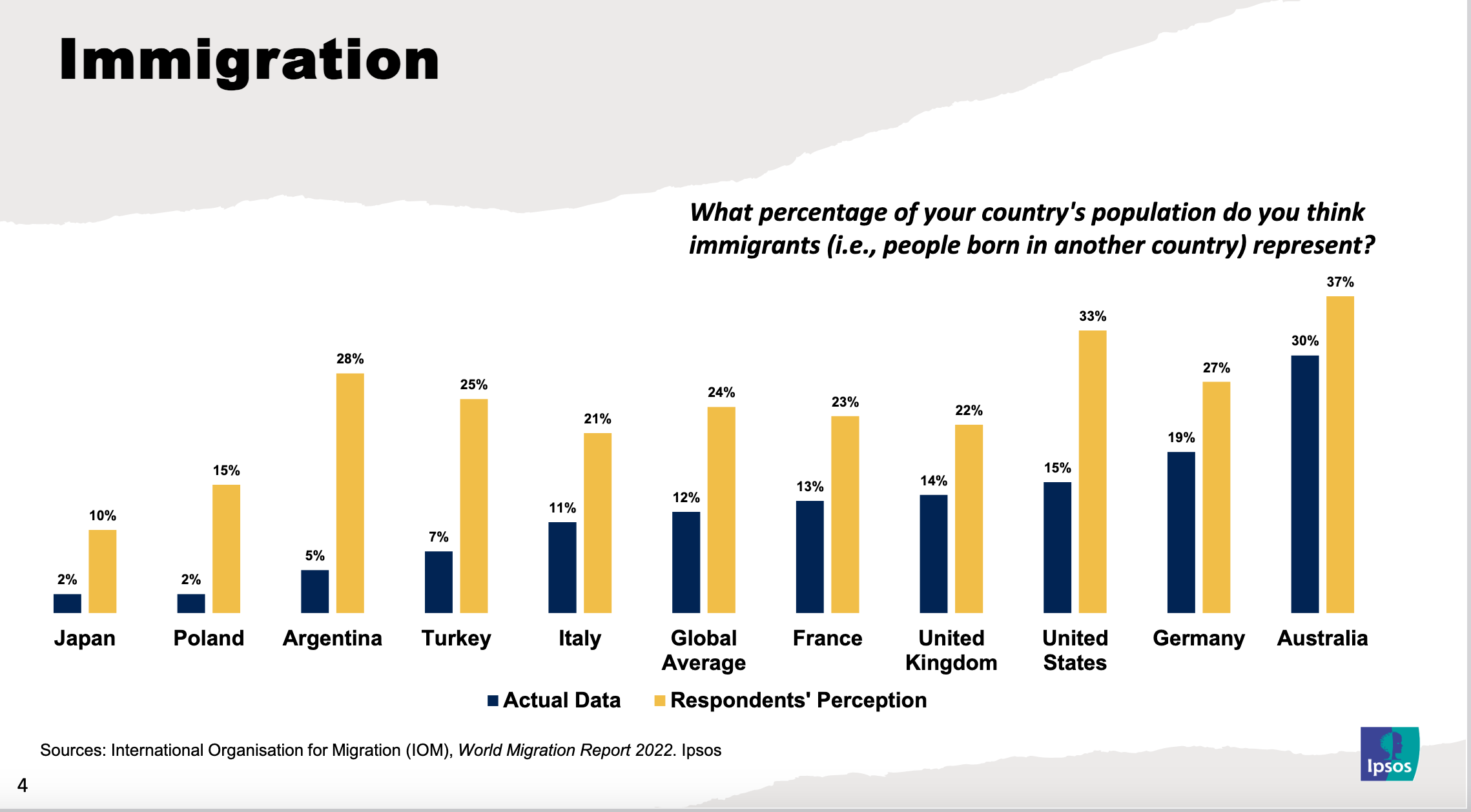
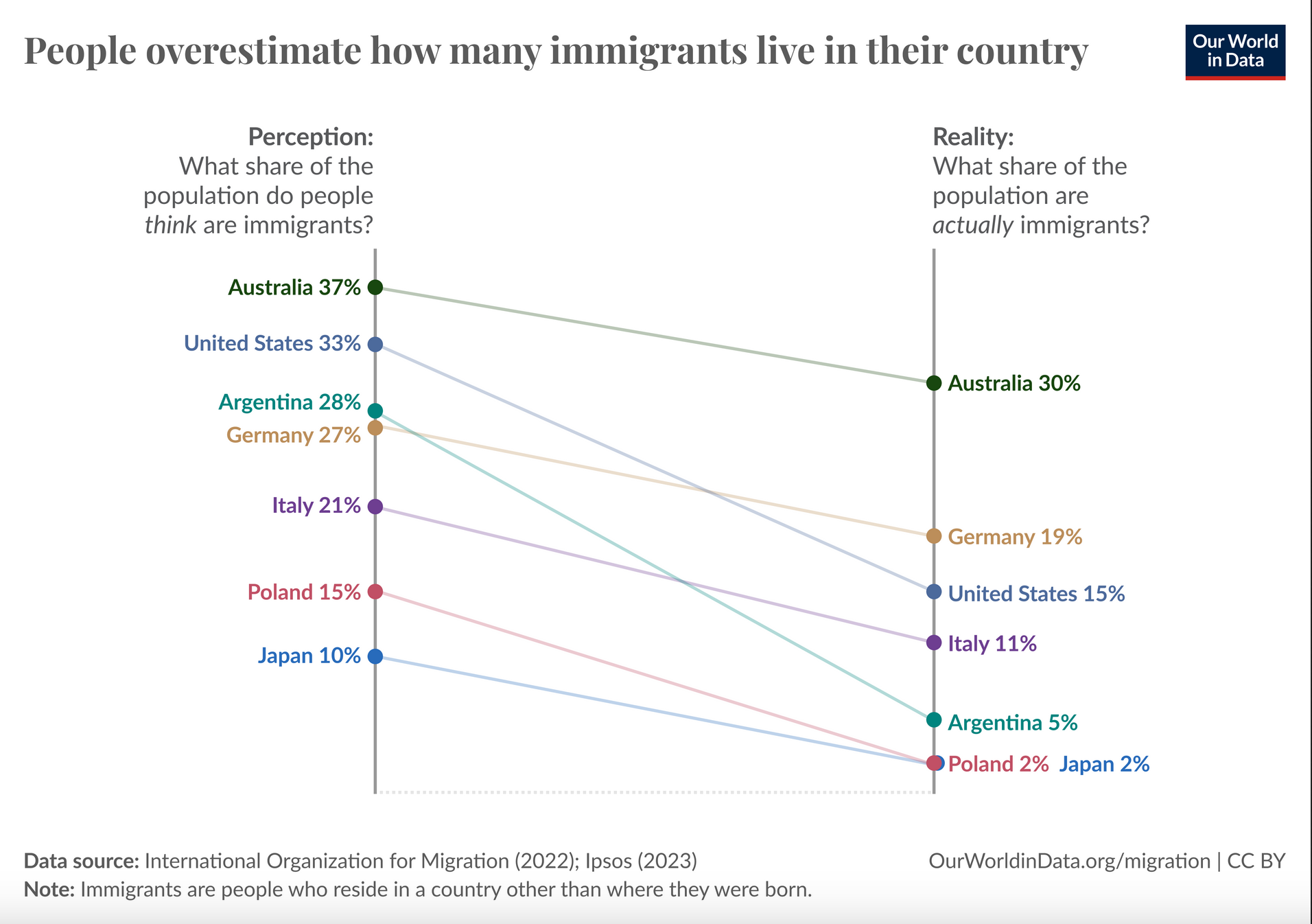
Apart from a couple of countries, the percentages are small. The graph is distorted as it's not showing the full 100%
Looks like most people, in most countries, are pretty close to accurate.
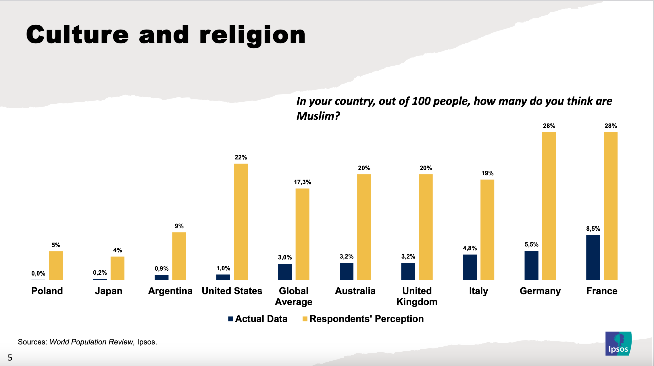
Alternative view (directly from the source):
IMO being off by around 10% or more is still quite the leap.
10% off isn't bad for a casual onlooker at their community. That's 90% accurate.
People don't give precise percentages though when surveyed. They might round to typical fractions like 1/4, 1/3, or they might round to 10 or 20 percent.
Nobody is saying "hmm, I estimate that it would be approximately 37 percent".
Of course the wisdom of the crowd does wonders for smoothing those coarse estimates, but still, if the crowd is +/- 10 of the real percentage value, I'd say they're pretty much on the money.
Anyway, Poland, wtf.
Yeah as much as I love to call people out for their racist bullshit, the results are surprisingly close to the mark. I was expecting the gap to be much wider. At least for the English speaking countries.