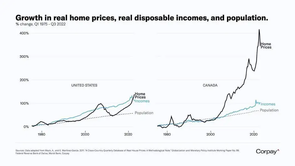
26
Data Is Beautiful
7319 readers
3 users here now
A place to share and discuss data visualizations. #dataviz
founded 4 years ago
MODERATORS
30
31
32
-1
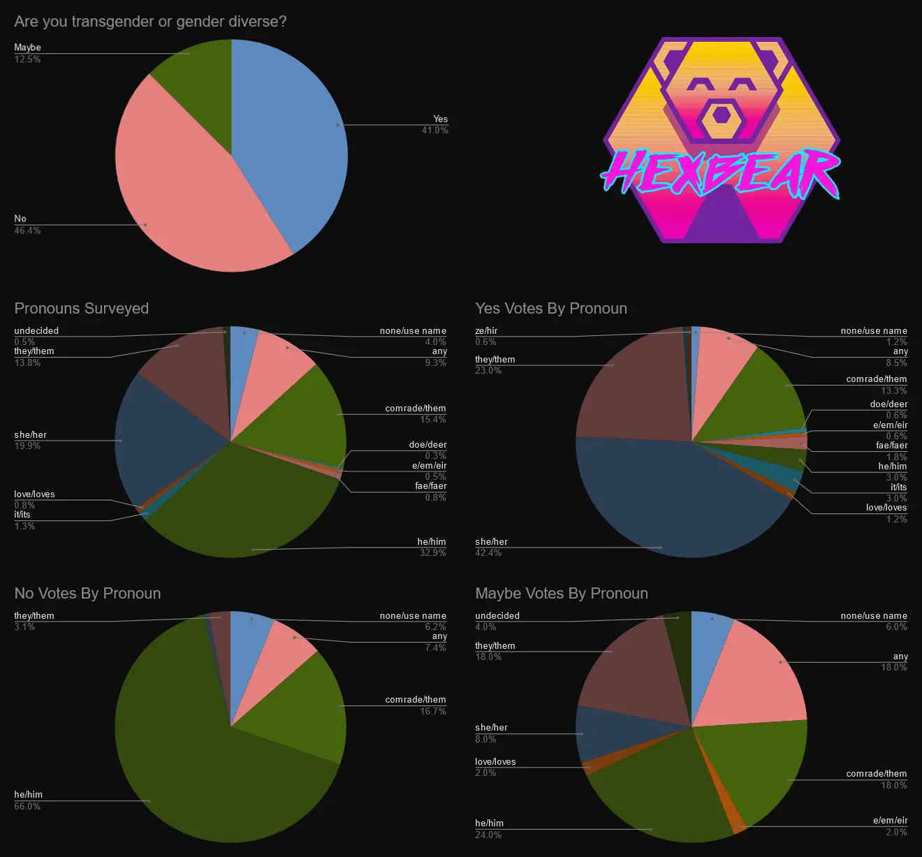
Dug up their survey for it out of curiosity, you can find their original post here https://hexbear.net/post/2226865
Interesting note on cis women https://hexbear.net/comment/4782033
33
EDIT: for some context on the problems this creates
The science is clear that fast-growing chickens like the Ross 308 are doomed by their genetics. These have been engineered to grow so incredibly fast, and their bodies just cannot handle it.”
Jackson said secret filming at broiler farms supplying big supermarkets has shown birds struggling to walk or collapsing under their own weight, or dying from heart failure, and dead birds were filmed lying among the flocks.
[...]
Andrew Knight, a professor of animal welfare and ethics at the University of Winchester, said: “With these really rapid growth rates, it can be difficult for the heart and circulatory system to keep up with the expanding body mass. A proportion of these animals suffer from heart failure. It’s also difficult for the bones, ligaments and tendons to keep up with the rapidly increasing body mass, meaning that a proportion of these birds become severely lame [inability to walk properly].”
And that quote only lists just some of the health problems they face. There's a ton of other problems too


37
0
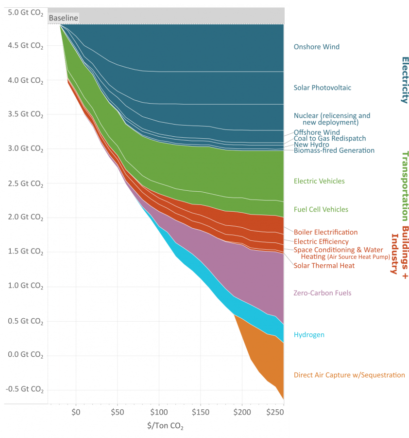
How much it costs to cut 1 metric ton of carbon emission with various methods for different global carbon emission levels
(www.edf.org)
As you reduce the amount of carbon emissions (the y axis) the methods to keep reducing carbon cost more (the x axis.)
This great graph came to my attention from this video from vlogbrothers. It also has some good explanations of what it means.
Note that carbon capture doesn't really make sense till you've exhausted all the other emission minimizing methods.
Source: https://www.edf.org/revamped-cost-curve-reaching-net-zero-emissions
38
Apologies. This might not be the perfect community for the post.


42


49
energy-charts.info provides a great overview over electricity generation by sector, renewable share and a lot of other data on the German electricity network. They also provide estimates for the next few hours and scenarios how the electricity network could look like in a few decades.
