Typography & fonts

482 readers
8 users here now

A community to discuss and share information about typography and fonts

Sibling community:

[email protected]

Rules of conduct:

The usual ones on Lemmy and Mastodon. In short: be kind or at least respectful, no offensive language, no harassment, no spam.

(Icon: detail from the title of Bringhurst's Elements of Typographic Style. Banner: details from pages 6 and 12, ibid.)

founded 2 years ago
MODERATORS
1
2
3
4
5
6


I quite like the new adaita font, though it has a bit less character than that new font open suse published a little while back.

But something more neutral isn't strictly a bad thing for an interface font I suppose

Hope y'all are having a good day :)

7
 
 
8


cross-posted from: https://lemmy.ml/post/27410537

Note that there still have been no studies on its efficacy. At worst, it is a great font to avoid ambiguity between characters.

9
10
11
12
The Scourge of Arial (www.marksimonson.com)
submitted 1 month ago by [email protected] to c/[email protected]
12


cross-posted from: https://feddit.org/post/8032101

From the author of the "Shift Happens" book that came out a little while ago.

spoilerIt's Gorton

This is now several crossposts deep but I wanted to share here :)

13


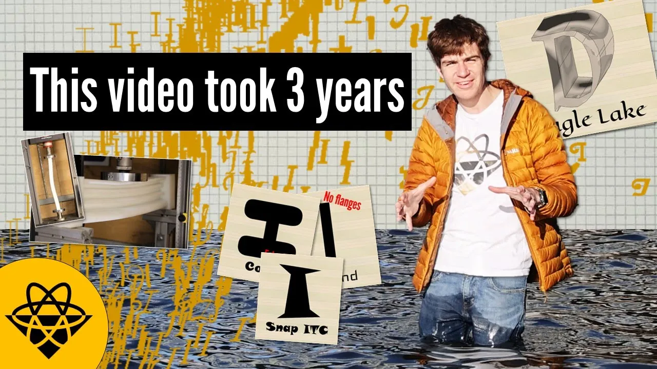
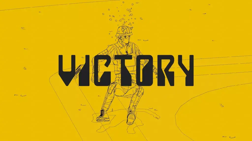
This is a cross-post from the map enthusiasts comm :)

14


Joke aside, there are several cool fonts in this one from 1892:

https://archive.org/details/CentralBoston1892Specimen/page/n73/mode/2up

15
16


The font I'm looking for is in the title bar of this window.

17


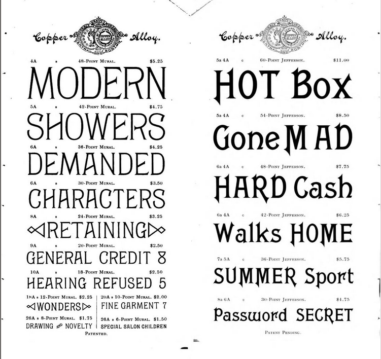
Can anyone identify this font? The title page in the ebook is an image, and there's no credit listed, and my web searches have all been dead ends.

I'm not certain there aren't three similar fonts; there are at least two distinct fonts here, and maybe three, although they could all be in the same family -- Bold, Normal, and Light. I'm most interested in the middle font, but all three are interesting.

It's a striking title page, and I'd really like to ID these. My fall back will be to write the publisher and ask, but I'm hoping someone here will be able to toss the family off the top of their head.

18


It not often we get to have a nice looking modern pixel font. Designed by Helena Zhang. It has good international support and even old-style numerals!

It is on a SIL open font license "you can use them in books, posters, artwork, logos, and on websites, even make 3D objects with the outlines—no acknowledgement is required".

19


Pictures at the end.

This Release is from March 2023 but we're starting to see product on the shelf with the new look. I'm not a fan. The lettermark seems less distinctive to me. Too thick. What do you all think?

20


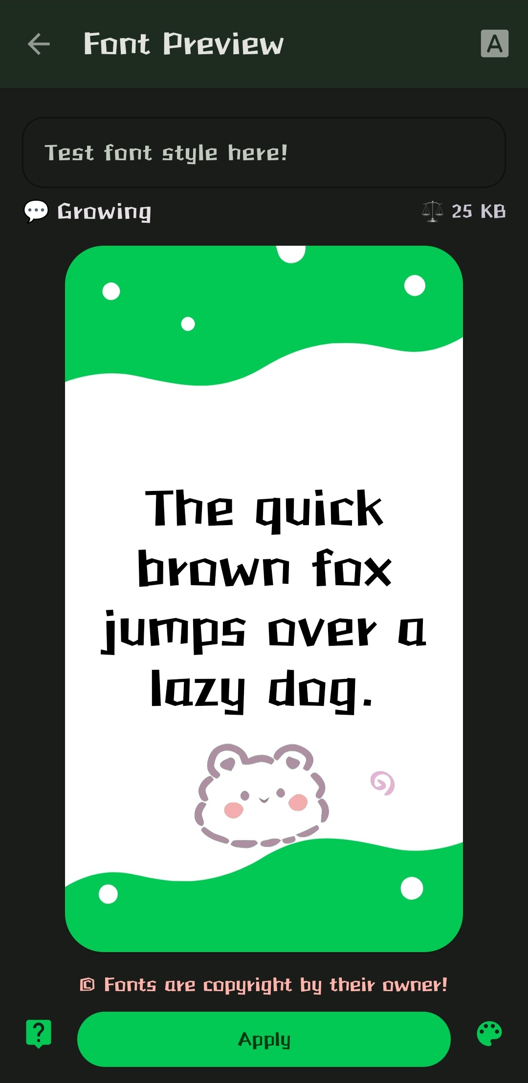
Hi everyone! Just wanted to ask if anyone has any idea what this typeface is actually called? It says it's called "Growing", but I couldn't find it under that name... If anyone has a clue, or an idea of where I can search... I'll be thankful for anything you can provide. Have a nice day y'all!

21


Its not much, as its a variation on Iosevka, exclusively for programming, and I made it a while ago, but I wanted to see what the community thinks. (I tried including a picture with the post but it failed to upload for some reason)

I'd love to see more open source self-made fonts. Any criticisims on functionality, or recommended changes are welcome.

22


I'm currently on the lookout for something quite specific:

  • Old style serif
  • Fairly heavy (not light at least)
  • Low contrast
  • Close to upright axis

I'm hoping those terms make sense, I'm not an expert :)

Where would you go for specific requirements like this? Most websites I find only have basic filters like serif/sans serif. Any suggestions for where to look, or maybe you know a nice font that fits what I listed above?

23
 
 
24


“Today we begin the final phase of this major change where Aptos will start appearing as the new default font across Word, Outlook, PowerPoint and Excel for hundreds of millions of users,” explains Si Daniels, a principal program manager at Microsoft, in a design blog post today. “And, over the next few months it will roll out to be the default for all our customers.”“Today we begin the final phase of this major change where Aptos will start appearing as the new default font across Word, Outlook, PowerPoint and Excel for hundreds of millions of users,” explains Si Daniels, a principal program manager at Microsoft, in a design blog post today. “And, over the next few months it will roll out to be the default for all our customers.”

I'm not sure I understand why they want to replace Calibri, but I guess a fresh typeface every now & then isn't a bad thing.

What do you all think of this Aptos?

25


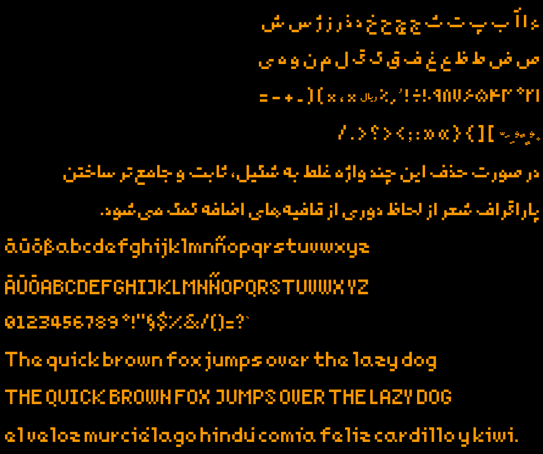
Last year I made a new pixelated free typeface for my 2d game. It has Arabic, Persian, and a subset of Latin glyphs enough for English, German and Spanish texts. Inside the repo you'd find makefile to build the font and generate test outputs.

Since it was my first experience designing a typeface ever, I might have made mistakes not known to me. That's why I post this, hoping someone would point them out. Here is the repo

https://github.com/mehdisadeghi/Noqte

view more: next ›